Data Analysis
It’s been some time but I really wanted to dive into data analysis again. We did plenty of classic examples at college - Titanic, Diabetes, Air Quality, Credit Card Default…. Even though real datasets are almost always more messy than datasets from Kaggle, it is always such an interesting challenge to search for real insights from data. I’ve been also thinking about whether data analysis is still relevant despite the capabilities of LLMs and AI, and while I think that AI can plot graphs for you and clean your data, they can’t make the real decisions, assumptions and they can’t tell you the truth. (At least, not yet 😉). For business, you need to make conclusions, present your decisions, have evidence, you need to know what’s meaningful and you need to ask the right questions. On top of that, companies are generating more data than ever.
Exploratory data analysis (EDA) is the key part of data analysis. It includes:
- descriptive statistics and an overview of the dataset
- pair analysis, e.g. correlations
- forming hypotheses
- identifying problems with the data - e.g. missing values, duplicate values, improper data structure, outliers, and so on
Based on insights identified in EDA, we move to data pre-processing. It usually involves:
- deduplication
- different strategies for inputting missing data
- dealing with outliers
- data mapping, e.g. encoding categorical variables
EDA helps us understand the structure and quality of the data and generate hypotheses. If the business question is predictive—for example, identifying customers at risk of churn—we can then build and evaluate a classification model.
Customer Churn Analysis
What is churn? Usually business should define what classifies as churn, but usually it means - people who cancelled their subscription or stopped using the product. Retention is extremely important for businesses and one of the metrics to track is the churn rate.
For this project, we will be using the Kaggle Telecom Churn Dataset, which consists of cleaned customer activity data (features), along with a churn label specifying whether a customer canceled the subscription.
The final notebook is available here
Look at the Data
In the churn dataset, there are several columns, and some are more useful than others. The target column to predict is simply ‘Churn’ (Yes/No or 1/0 - we will actually replace all categorical variables with numeric values).
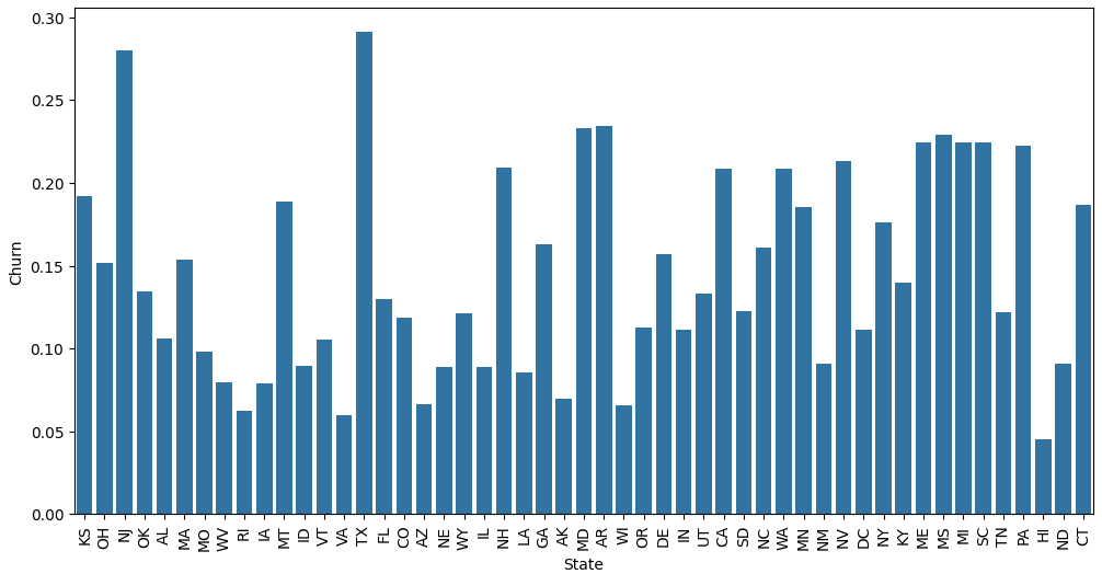
I was thinking about starting with forming some hypotheses. We want to check how significant are certain columns and possibly drop them. There are columns such as state that have high cardinality, and we need to ask “Is the overall pattern of this relationship meaningful and clear?”. But sometimes even if we reject the null hypothesis, we have to use our own judgment, supported by the data. While the chi-square test on State vs Churn returned a p-value of 0.00468, I noticed several states had fewer than 5 expected churners in this sample, which makes the result less reliable. Rather than over-interpreting this, I’d treat geographic patterns here as exploratory rather than conclusive. So you’d reject the null hypothesis and conclude state and churn are not independent. BUT this is where the nuance matters. However, practically speaking, the effect appears driven by a handful of outlier states - particularly Texas (29%) and New Jersey (28%) - rather than a consistent geographic pattern. Most states cluster around the dataset’s overall churn rate of ~14-15%, suggesting state alone is unlikely to be a strong predictive feature.
More checks:
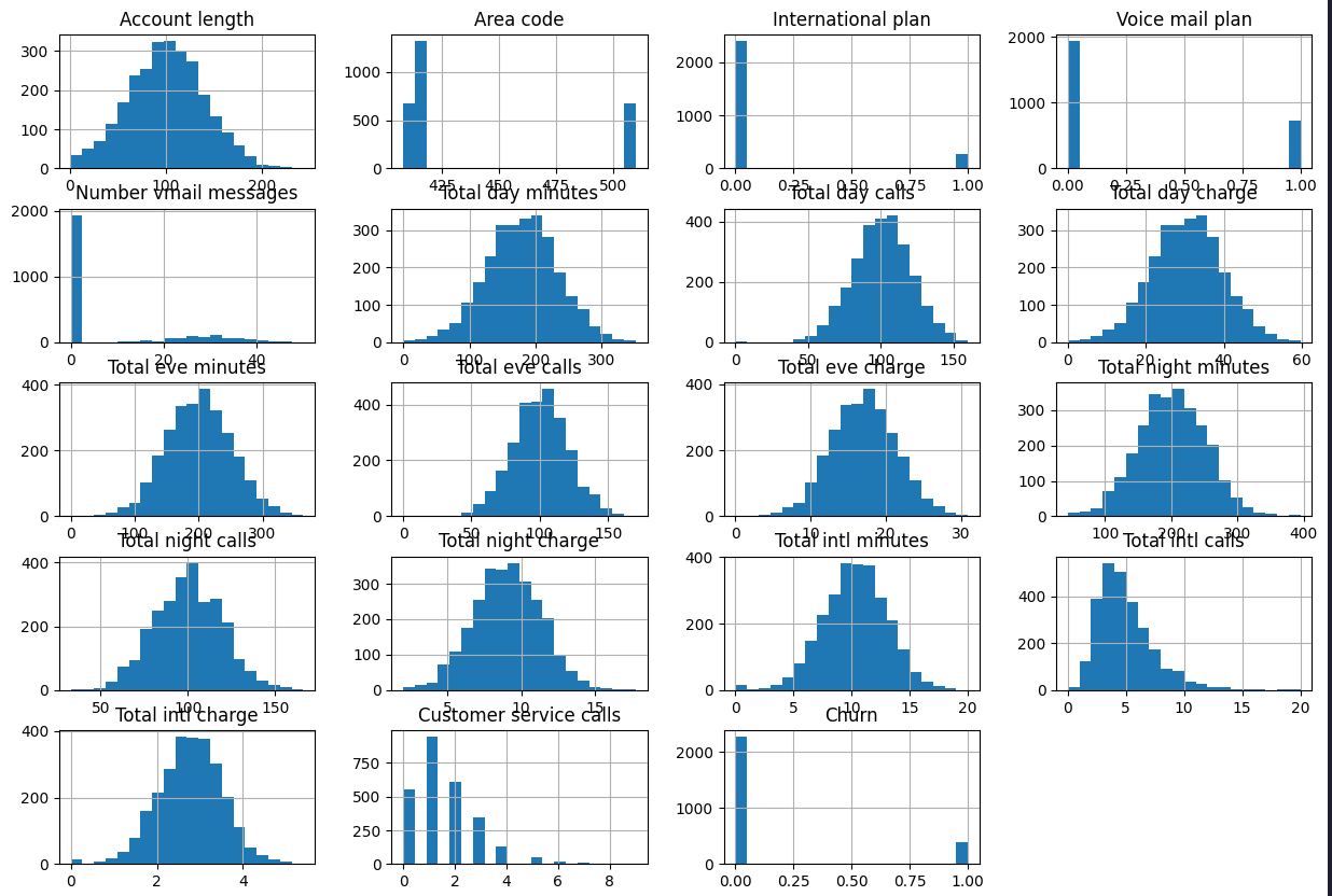
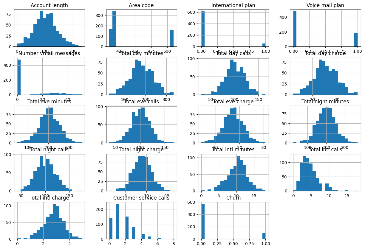
- checking the distributions in the training and test sets, we can see their distribution is similar
Train distribution:
 Test distribution:
- There are no missing values
Next, we look at the pairplot. We see that multiple attributes are perfectly correlated - total day charge and total day minutes, and then the same for evenings, nights and international. High minutes = high charge by definition, not an independent signal. This is not good for the model, we will drop one of them later. It also shows that people who call support more often churn more (orange dots). Also, possibly people with international plan churn more. Perhaps people who use the service the most get charged the most, and they also call support before leaving.
We are seeing:
- Association between Churn & International Plan
- Association between Churn & Total day minutes
- Association between Churn & Total day charge
- Association between Churn & Customer service calls
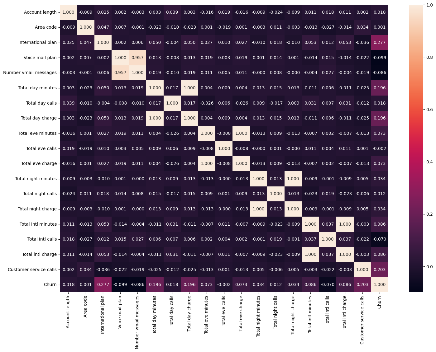
Some thoughts:
- We are seeing correlation between customer service calls and churn. We will check how confident we are (that the difference is not random)
- customer calls are numerical, churn is categorical
- Check Normality (Shapiro-Wilk + Q-Q plot)
- Based on the results, do t-test or Mann-Whitney
churned = df80_train[df80_train['Churn'] == True]['Customer service calls']
not_churned = df80_train[df80_train['Churn'] == False]['Customer service calls']

# Check Normality
stat1, p1 = shapiro(churned)
stat2, p2 = shapiro(not_churned)

# Combined
stat3, p = shapiro(df80_train['Customer service calls'])

print(f"Shapiro-Wilk test for churned customers: statistic={stat1:.4f}, p-value={p1:.5f}")
print(f"Shapiro-Wilk test for non-churned customers: statistic={stat2:.4f}, p-value={p2:.5f}")
print(f"Combined Shapiro-Wilk test: statistic={stat3:.4f}, p-value={p:.5f}")

# p < 0.05 → not normal

# Q-Q plot
fig, axes = plt.subplots(1, 3, figsize=(14, 4))

stats.probplot(df80_train['Customer service calls'], plot=axes[0])
axes[0].set_title('Combined')

stats.probplot(churned, plot=axes[1])
axes[1].set_title('Churned customers')

stats.probplot(not_churned, plot=axes[2])
axes[2].set_title('Non-churned customers')

plt.suptitle('Q-Q plots: Customer service calls')
plt.tight_layout()
plt.show()

# Both Shapiro-Wilk and Q-Q plots indicate that the data is not normally distributed. Therefore, we will use the Mann-Whitney U test to compare the two group
stat, p = mannwhitneyu(churned, not_churned, alternative='two-sided')
print(f"Mann-Whitney U p-value: {p:.5f}")
print(f"\nMedian calls (churned): {churned.median()}")
print(f"Median calls (not churned): {not_churned.median()}")

# The p-value is below 0.05, providing evidence against the null hypothesis of equal distributions
# The median number of customer-service calls was twice as high among churners (2 vs. 1)
Let’s combine all charges into one feature: Total Charges
df80_train["Total Charges"] = df80_train["Total day charge"] + df80_train["Total eve charge"] + df80_train["Total night charge"] + df80_train["Total intl charge"]

df20_test["Total Charges"] = df20_test["Total day charge"] + df20_test["Total eve charge"] + df20_test["Total night charge"] + df20_test["Total intl charge"]
The charge variables are largely deterministic functions of usage minutes, so they contain overlapping information. I aggregate them into a single total-charge feature to reduce redundant features while retaining the overall usage-cost signal.
This will also show high correlation between total charges and churn, which makes sense - assuming the more a customer has to pay, the more likely they are to churn, and boxplot shows that customers who churn have higher total charges on average.
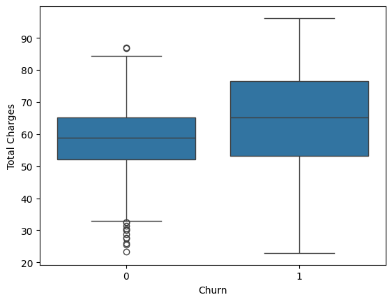
We also do a test for churn and total charges, similar to Churn and Customer Service Calls.
Overall conclusion: Churn is not driven by one single dominant factor — it’s a combination of signals. No single feature has a strong enough relationship with churn to predict it reliably alone. In fact, this is why we use machine learning models.
The story this tells so far: Churners are paying more AND calling support more. One possible interpretation is a ‘frustrated high-value customer’ pattern: customers with higher usage charges also make more support calls and may be more likely to churn. However, this dataset is observational, so we cannot establish that support issues caused the churn.
Classification
We want to predict the churn label in the dataset (in general terms, customers who are likely to churn, so Churn is our target variable). Classification predicts categories e.g. churn/no churn.
Some popular classification algorithms are:
- Random forest
- KNN
- Logistic regression (despite its name)
- Support Vector Machine (SVM)
- and many more
One more thing: we drop total day minutes, total eve minutes, total night minutes, total intl minutes, since they had 100% correlation. We prepare our dataset, and then we are all set.
X_train = df80_train.drop(columns=["Churn"])
y_train = df80_train["Churn"]
X_test = df20_test.drop(columns=["Churn"])
y_test = df20_test["Churn"]
Logistic Regression
These algorithms follow a relatively similar pattern. We will also start with just default values, and move on from there.
from sklearn.linear_model import LogisticRegression

lr = LogisticRegression(max_iter=100, solver='liblinear')
lr.fit(X_train, y_train)

y_pred_lr = lr.predict(X_test)

y_pred_proba_lr = lr.predict_proba(X_test)[:, 1]  # Get the probabilities for the positive class
plot_metrics(y_test, y_pred_lr, y_pred_proba_lr, "Logistic Regression")
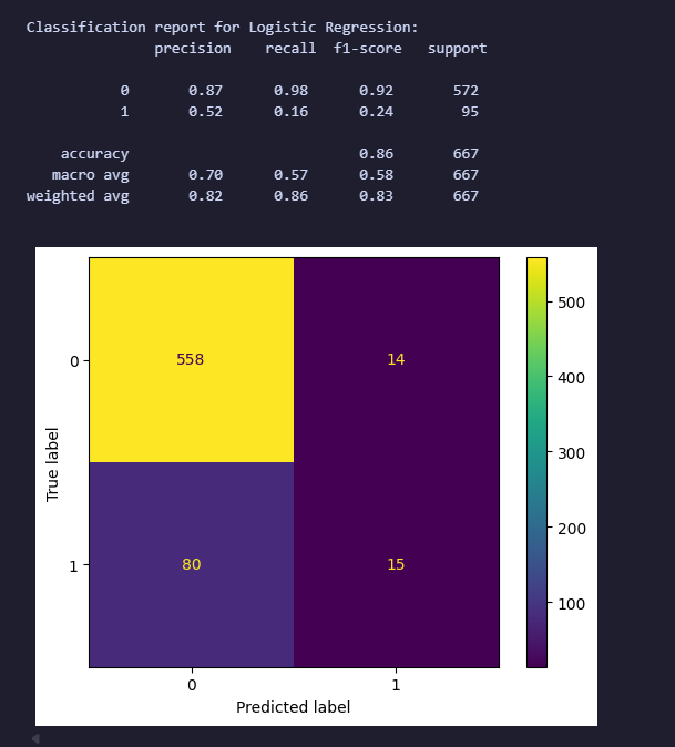
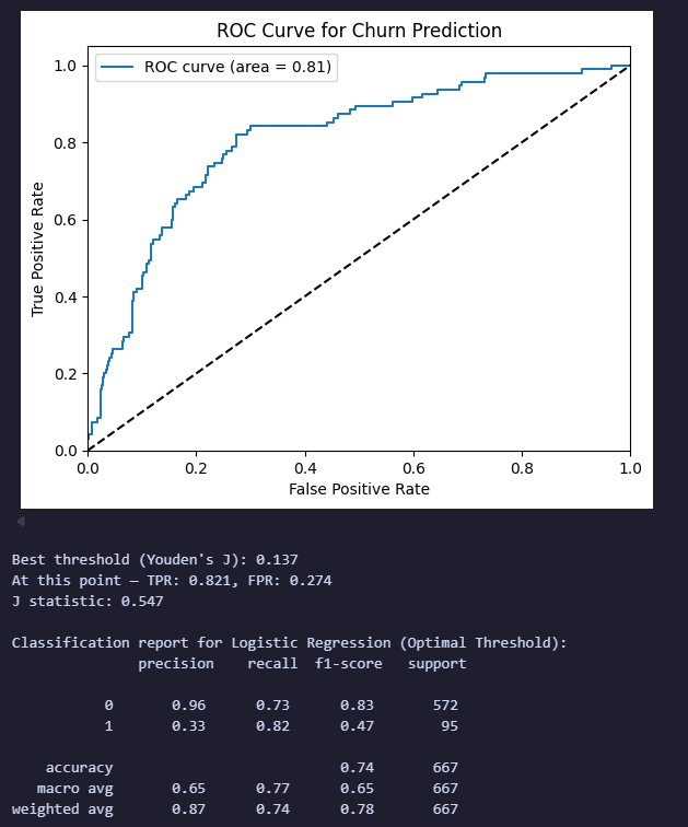
Some things to mention:
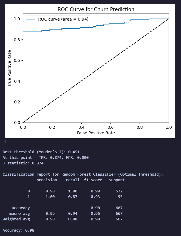
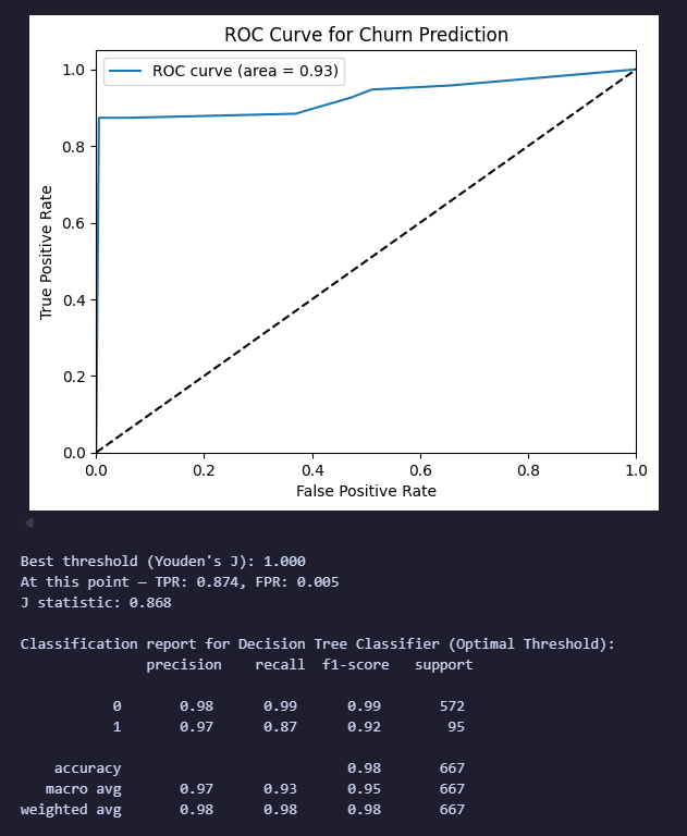
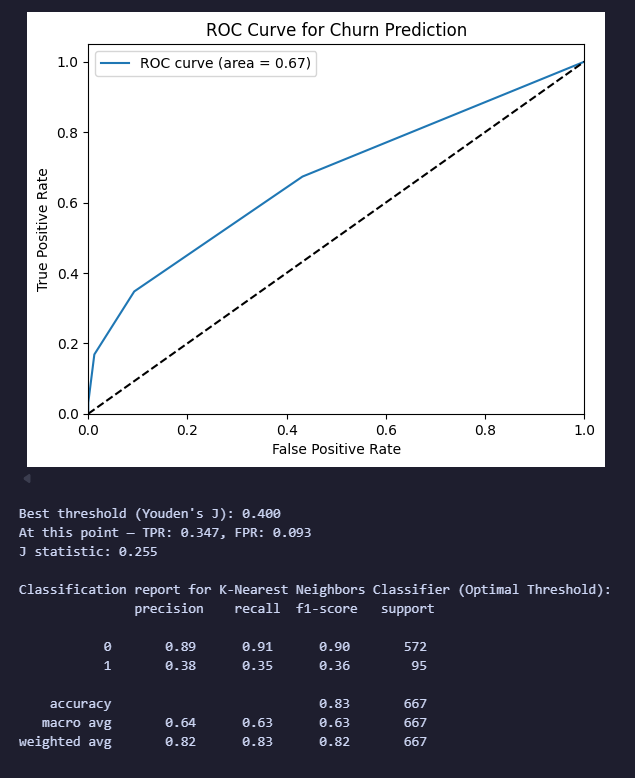
- The ROC curve is created by plotting the true positive rate (TPR) against the false positive rate (FPR) at various threshold settings. - Youden Index. Use Youden index to determine the optimal cut‐off if the cost of FN=FP. (Otherwise, use your gut feeling 🙃) The area under the ROC curve (AUC) is a common metric used to quantify the overall performance of a classification model. An AUC of 1 represents a perfect model, while an AUC of 0.5 represents a model that is no better than random guessing.
- In our model: Best threshold (Youden’s J): 0.137
- This means: instead of using the default 0.5 cutoff to classify someone as “will churn”, use 0.137. If model predicts a probability of churn ≥ 0.137, classify them as “will churn”. This is a much lower bar than 0.5. Why so low? Because churn is imbalanced — far fewer people churn than don’t. The model rarely predicts probabilities above 0.5 for anyone, even actual churners, because churners are the minority class. Lowering the threshold catches more of them.
TPR: 0.821 -> True Positive Rate (= Recall = Sensitivity) → Of all the customers who actually churned, correctly caught 82.1% of them at this threshold.
FPR: 0.274 -> False Positive Rate → Of all the customers who did NOT churn, incorrectly flagged 27.4% of them as “will churn” anyway.
J statistic: 0.547 → TPR − FPR = 0.821 − 0.274 = 0.547 → The higher this number, the better the threshold separates churners from non-churners. Max possible is 1.0 (perfect), 0 means no better than random.
In other words: “I’d rather flag some loyal customers by mistake (false positives) if it means catching most of the people who are actually going to leave.” This makes business sense for churn - a false positive just means you send a retention offer to someone who wasn’t going to leave anyway, but a false negative means you lose a customer you could have saved (which is worse). Also think of it as: “This person’s risk score is high enough, relative to everyone else, that we should flag them for retention outreach.”
Lucia from the future: you’re using the test set to choose the threshold, then evaluating that threshold on the same y_test 🥲. That’s technically data leakage. A better approach would be to use a validation set to choose the threshold and keep the test set untouched for the final evaluation.
Random Forest
from sklearn.ensemble import RandomForestClassifier
from sklearn.metrics import accuracy_score

rf = RandomForestClassifier(n_estimators = 100, random_state = 123, max_depth = 9, criterion = "gini")
rf.fit(X_train, y_train)

y_pred_rf = rf.predict(X_test)

y_pred_proba_rf = rf.predict_proba(X_test)[:, 1]  # Get the probabilities for the positive class
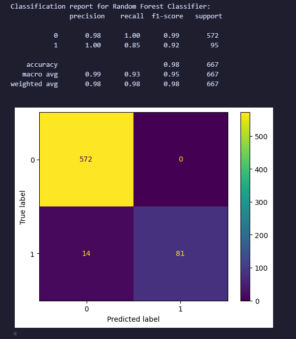
plot_metrics(y_test, y_pred_rf, y_pred_proba_rf, "Random Forest Classifier")
print(f"Accuracy: {round(accuracy_score(y_pred_rf, y_test), 2)}")
Random forest was being a little suspicious (no false positives, meaning the precision was 100%), but since this was an initial baseline with largely default hyperparameters, I treat these results as preliminary.
Decision Tree
from sklearn.tree import DecisionTreeClassifier

dt = DecisionTreeClassifier(random_state=123, max_depth=9, splitter='best', min_samples_split=2, min_samples_leaf=1)
dt.fit(X_train, y_train)

y_pred_dt = dt.predict(X_test)

y_pred_proba_dt = dt.predict_proba(X_test)[:, 1]  # Get the probabilities for the positive class
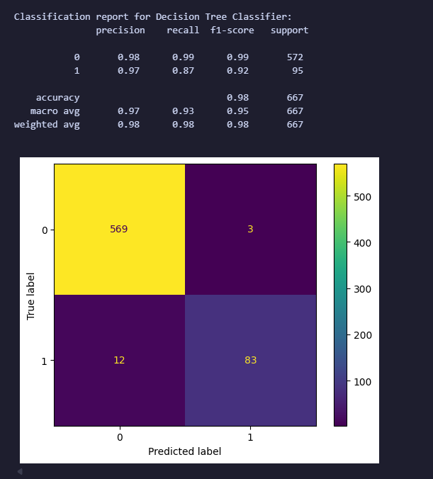
plot_metrics(y_test, y_pred_dt, y_pred_proba_dt, "Decision Tree Classifier")
KNN
from sklearn.neighbors import KNeighborsClassifier

knn = KNeighborsClassifier(n_neighbors=5, weights='uniform', algorithm='auto', p=2, metric='minkowski', metric_params=None, n_jobs=None)
knn.fit(X_train, y_train)

y_pred_knn = knn.predict(X_test)

y_pred_proba_knn = knn.predict_proba(X_test)[:, 1]  # Get the probabilities for the positive class
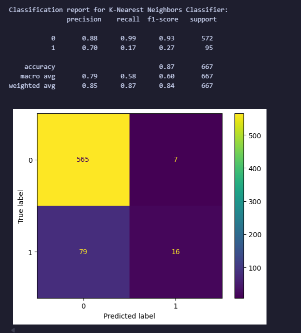
plot_metrics(y_test, y_pred_knn, y_pred_proba_knn, "K-Nearest Neighbors Classifier")
SVM
from sklearn.svm import SVC

svm = SVC(C=1.0, kernel='linear', probability=True, random_state=124)
svm.fit(X_train, y_train)

y_pred_svm = svm.predict(X_test)

y_pred_proba_svm = svm.predict_proba(X_test)[:, 1]  # Get the probabilities for the positive class
plot_metrics(y_test, y_pred_svm, y_pred_proba_svm, "Support Vector Machine")
The initial SVM performed poorly. Because SVMs are sensitive to feature scale, I standardized the numerical features and retrained an RBF SVM with class weighting.
from sklearn.preprocessing import StandardScaler

scaler = StandardScaler()
X_train_scaled = scaler.fit_transform(X_train)
X_test_scaled = scaler.transform(X_test)

svm_scaled = SVC(C=1, kernel='rbf', probability=True, random_state=124, class_weight='balanced', gamma='scale')
svm_scaled.fit(X_train_scaled, y_train)

y_pred_svm_scaled = svm_scaled.predict(X_test_scaled)
y_pred_proba_svm_scaled = svm_scaled.predict_proba(X_test_scaled)[:, 1]

plot_metrics(y_test, y_pred_svm_scaled, y_pred_proba_svm_scaled, "Support Vector Machine (Scaled)")
.png)
.png)
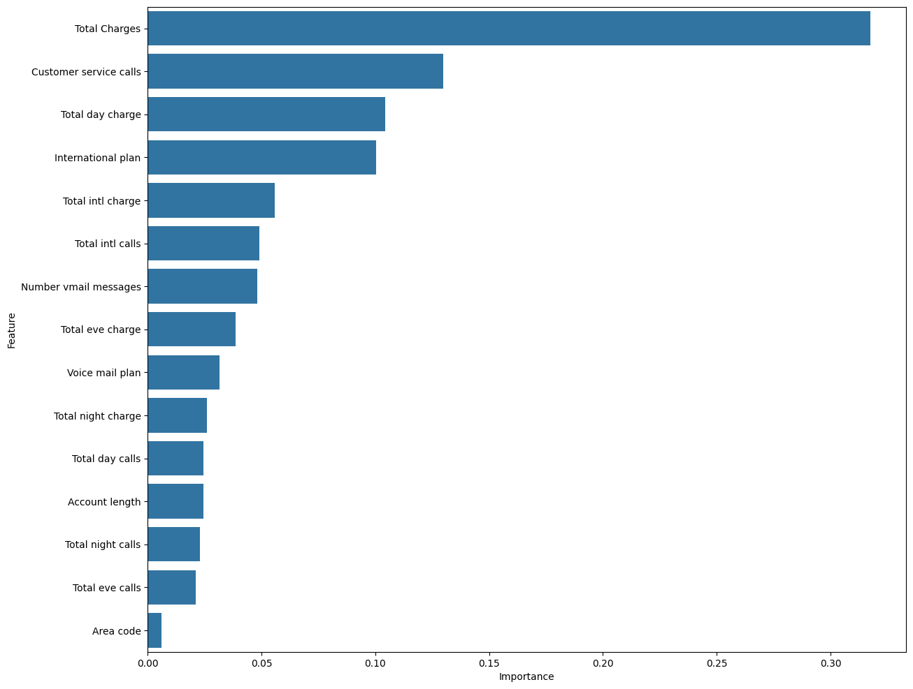
By the way, let’s check the feature importance (from RF)
importances = rf.feature_importances_
feature_names = X_train.columns

importance_df = pd.DataFrame({
    'Feature': feature_names,
    'Importance': importances
}).sort_values(by='Importance', ascending=False)

importance_df

plt.figure(figsize=(14, 12))

sns.barplot(x="Importance", y="Feature", data=importance_df)
plt.show()

# Truly a full circle moment
Another improvement we can include is Grid Search, which helps us find the best hyperparameters for the model.
from sklearn.model_selection import GridSearchCV

param_grid = {
    'C': [0.1, 1, 10, 100],
    'kernel': ['rbf', 'linear'],
    'gamma': ['scale', 'auto', 0.01, 0.1]
}

grid_search = GridSearchCV(SVC(probability=True, random_state=124, class_weight='balanced'), param_grid, cv=5, scoring='roc_auc', n_jobs=-1)
grid_search.fit(X_train_scaled, y_train)

best_svm = grid_search.best_estimator_
print("Best parameters found: ", grid_search.best_params_)

y_pred_best_svm = best_svm.predict(X_test_scaled)
y_pred_proba_best_svm = best_svm.predict_proba(X_test_scaled)[:, 1]
plot_metrics(y_test, y_pred_best_svm, y_pred_proba_best_svm, "Best Support Vector Machine (Scaled)")
.png)
.png)
Compare Model Results
Final thoughts:
- SVM was performing poorly, so we scaled (Standard Scaler)
- Can improve with grid search, cross validation
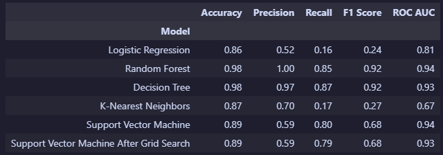
- In table below, we can see the final results, but we don’t really have an obvious winner
- The good old Precision/Recall trade-off: depends on the domain and use-case High recall = catch almost every customer who’s about to leave (good — you don’t lose them silently) but you’ll also bother some loyal customers with retention offers they didn’t need (false positives) High precision = only target customers you’re very confident will churn, but you’ll miss some real churners who slipped through (false negatives)